Chapter 8 Basketball shots
When playing basketball we can ask ourselves: how likely is it to score given a position in the court? To answer this question we are going to use data from NBA games from the 2006 - 2007 season. Lets load the data into our Julia session and inspect the column names:
shots = CSV.read("./08_basketball_shots/data/seasons/shots_season_2006_2007.csv", DataFrame);
names(shots)
## 5-element Vector{String}:
## "result"
## "x"
## "y"
## "period"
## "time"The columns of our dataset are the following:
result: Stores a 1 if the shot was successful and a 0 otherwise.
x: The x-component of the position of the player when the shot was made.
y: The y-component of the position of the player when the shot was made.
period: Indicates in which of the four periods of a basketball game the shot was done.
time: The exact time the shot was made.
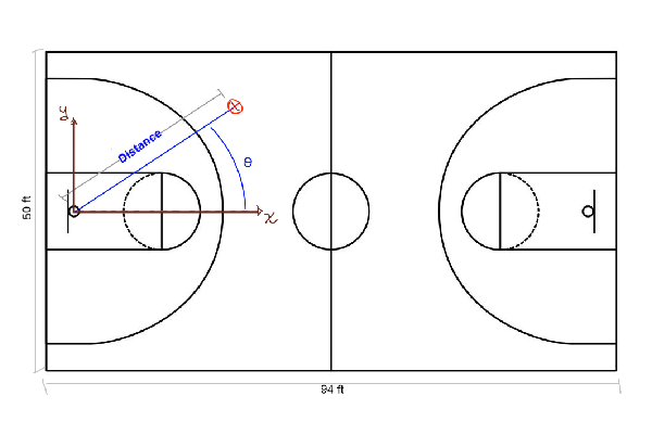
Below we show a sketch of a basketball court, its dimensions and how to interpret the data in the table. It would be useful to change the shot coordinates from cartesian (x and y coordinates) to polar. In this way, we can think about the problem considering the distance and the angle from the hoop.
shots[!, :distance] = sqrt.( shots.x .^ 2 + shots.y .^ 2)
shots[!, :angle] = atan.( shots.y ./ shots.x )
filter!(x -> x.distance > 1, shots)
So, the \(x\) and \(y\) axis have their origin at the hoop, and we compute the distance from this point to where the shot was made. Also, we compute the angle with respect to the \(x\) axis, showed as θ in the sketch.
Lets now plot where the shots were made with a two-dimensional histogram. As more shots are made in a certain region of the field, that region is shown with a brighter color.
histogram2d(shots.y[1:10000], shots.x[1:10000], bins=(50,30));
xlabel!("x axis");
ylabel!("y axis")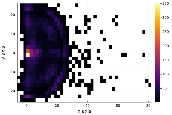
We see that the shots are very uniformly distributed around the hoop, except for distances very near to the hoop. To see this better, we plot the histograms for each axis, \(x\) and \(y\). As we are interested in the shots that were scored, we filter the shots made and plot the histogram of each axis.
shots_made = filter(x -> x.result == 1, shots)histogram(shots_made.y[1:10000], legend=false, nbins=40);
xlabel!("x axis");
ylabel!("Counts")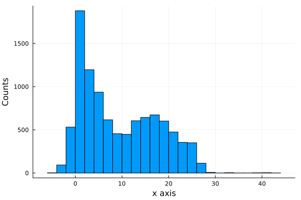
histogram(shots_made.x[1:10000], legend=false, nbins=45);
xlabel!("y axis");
ylabel!("Counts")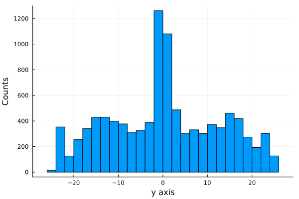
We can also summarize all this information with a wireplot, as shown below
h = fit(Histogram, (shots_made.y, shots_made.x), nbins=40);
wireframe(midpoints(h.edges[2]), midpoints(h.edges[1]), h.weights, zlabel="counts", xlabel="y", ylabel="x", camera=(40,40));
xlabel!("x");
ylabel!("y");
title!("Histogram of shots scored")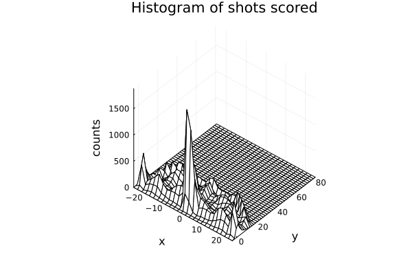 More shots are made as we get near the hoop, as expected.
It is worth noting that we are not showing the probability of scoring, we are just showing the distribution of shot scored, not how likely is it to score.
8.1 Modelling the scoring probability
The first model we are going to propose is a Bernoulli model.
A Bernoulli distribution results from an experiment in which we have two possible outcomes, one that is usually called a success and another called a failure. In our case our success is scoring the shot and the other possible event is failing it.
The only parameter needed in a bernoulli distribution is the probability \(p\) of having a success. We are going to model this parameter as a logistic function:
plot(logistic, legend=false);
xlabel!("x");
ylabel!("Probability");
title!("Logistic function (x)")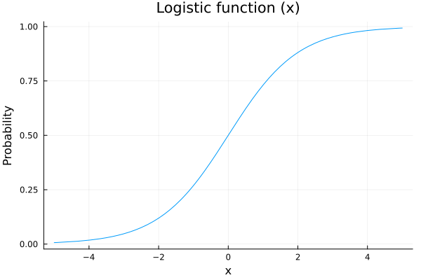
The reason to choose a logistic function is that we are going to model the probability of shootiing as a function of some variables, for example the distance to the hoop, and we want that our scoring probability increases as we get closer to it. Also out probability needs to be between 0 an 1, so a nice function to map our values is the logistic function.
The probabilistic model we are going to propose is
\(p\sim logistic(a + b*distance[i] + c*angle[i])\)
\(outcome[i]\sim Bernoulli(p)\)
As you can see, this is a very general model, since we haven’t yet specified anything about \(a\), \(b\) and \(c\). Our approach will be to propose prior distributions for each one of them and check if our proposals make sense.
8.2 Prior Predictive Checks: Part I
Lets start by proposing Normal prior distributions for \(a\), \(b\) and \(c\), i.e., Gaussian distributions with mean 0 and variance 1. Lets sample and see what are the possible predictions for \(p\):
\(a\sim N(0,1)\)
\(b\sim N(0,1)\)
\(c\sim N(0,1)\)
possible_distances = 0:0.01:1
possible_angles = 0:0.01:π/2
n_samples = 100

# we sample possible values from a and b
a_prior_sampling = rand(Normal(0,1), n_samples)
b_prior_sampling = rand(Normal(0,1), n_samples)

# with the sampled values of a and b, we make predictions about how p would look
predicted_p = []
for i in 1:n_samples
    push!(predicted_p, logistic.(a_prior_sampling[i] .+ b_prior_sampling[i] .* possible_distances))
endplot(possible_distances, predicted_p[1], legend = false, color="blue");
for i in 2:n_samples
plot!(possible_distances, predicted_p[i], color=:blue);
end
xlabel!("Normalized distance");
ylabel!("Predicted probability");
title!("Prior predictive values for p")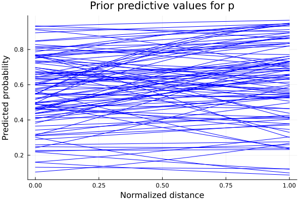
Each one of these plots is the result of the logistic with one combination of \(a\) and \(b\) as parameters. We see that some of the predicted values of \(p\) don’t make sense. For example, if \(b\) takes positive values, we are saying that as we increase our distance from the hoop, the probability of scoring also increases. As we want \(b\) to be a negative number, we should propose a distribution which we can sample from and be sure their values have always the same sign. One example of this is the LogNormal distribution, which will give us always positive numbers. Multiplying these values by \(-1\) gives us the certainty that we will have a negative number. We update our model as follows:
\(a\sim Normal(0,1)\)
\(b\sim LogNormal(1,0.25)\)
\(c\sim Normal(0,1)\)
Repeating the sampling process with the updated model, we get the following predictions for \(p\):
b_prior_sampling_negative = rand(LogNormal(1,0.25), n_samples)
predicted_p_inproved = []
for i in 1:n_samples
    push!(predicted_p_inproved, logistic.(a_prior_sampling[i] .- b_prior_sampling_negative[i].*possible_distances))
endplot(possible_distances, predicted_p_inproved[1], legend = false, color=:blue);
for i in 2:n_samples
plot!(possible_distances, predicted_p_inproved[i], color=:blue);
end
xlabel!("Normalized distance");
ylabel!("Predicted probability");
title!("Prior predictive values with negative LogNormal prior")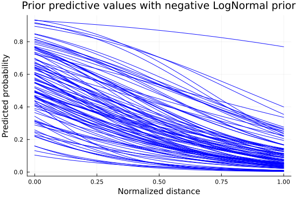
Now the behavior we can see from the predicted \(p\) curves is the expected. As the shooting distance increases, the probability of scoring decreases. We have set some boundaries in the form of a different prior probability distribution. This process is what is called prior-predictive checks. Esentially, it is an iterative process where we check if our initial proposals make sense. Now that we have the expected behaviour for \(p\), we define our model and calculate the posterior distributions with our data points.
8.2.1 Defining our model in Turing and computing posteriors
Now we define our model in the Turing framework in order to sample from it:
@model logistic_regression(distances, angles, result,n) = begin
  N = length(distances)
    # Set priors.
    a ~ Normal(0,1)
    b ~ LogNormal(1,0.25)
    c ~ Normal(0,1)

    for i in 1:n
        p = logistic(a - b*distances[i] + c*angles[i])
        result[i] ~ Bernoulli(p)
    end
end
n = 1000The output of the sampling tells us also some information about sampled values for our parameters, like the mean, the standard deviation and some other computations.
# Sample using HMC.
chain = mapreduce(c -> sample(logistic_regression(shots.distance[1:n] ./ maximum(shots.distance[1:n] ), shots.angle[1:n], shots.result[1:n], n), NUTS(), 1500), chainscat, 1:3);
8.2.1.1 Traceplot
In the plot below we show a traceplot of the sampling. When we run a model and calculate the posterior, we obtain sampled values from the posterior distributions. We can tell our sampler how many sampled values we want. A traceplot just shows them in sequential order. We also can plot the distribution of those values, and this is what is showed next to each traceplot.
plot(chain, dpi=60)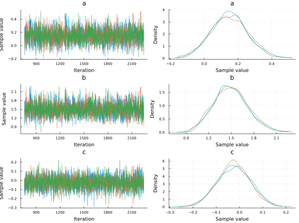
a_mean = mean(chain[:a])
b_mean = mean(chain[:b])
c_mean = mean(chain[:c])
Now plotting the scoring probability using the posterior distributions of \(a\), \(b\) and \(c\) for an angle of 45°, we get:
p_constant_angle = []
for i in 1:length(chain[:a])
    push!(p_constant_angle, logistic.(chain[:a][i] .- chain[:b][i].*possible_distances .+ chain[:c][i].*π/4));
endplot(possible_distances,p_constant_angle[1], legend=false, alpha=0.1, color=:blue);
for i in 2:1000
plot!(possible_distances,p_constant_angle[i], alpha=0.1, color=:blue);
end
xlabel!("Normalized distance");
ylabel!("Probability");
title!("Scoring probability vs Normalized distance (angle=45°)")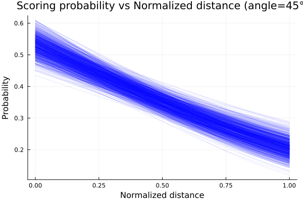
We clearly see how our initial beliefs got adjusted with the data. Although initially the decreasing scoring probability with increasing distance
behavior was correct, there was a lot of uncertainty about the expected value. What this last plot shows is how the possible values of p narrowed
as we updated our beliefs with data.
We already plotted how the scoring probability changes with respect to the distance from the hoop, but what about the angle? In principle, we could think that this should not be too relevant, since there is no special advantage on changing the angle from where we make our shot, but let’s see what does our model say when showing some real data to it. Just to keep the distance constant and only take into account the angle change, we plot for a miiddle distance, i.e., \(0.5\) in a normalized distance.
p_constant_distance = []
for i in 1:length(chain[:a])
    push!(p_constant_distance, logistic.(chain[:a][i] .- chain[:b][i].*0.5 .+ chain[:c][i].*possible_angles));
endplot(rad2deg.(possible_angles), p_constant_distance[1], legend=false, alpha=0.1, color=:blue);
for i in 2:1000
plot!(rad2deg.(possible_angles), p_constant_distance[i], alpha=0.1, color=:blue);
end
xlabel!("Angle [deg]");
ylabel!("Probability");
title!("Scoring probability vs Angle (mid distance)")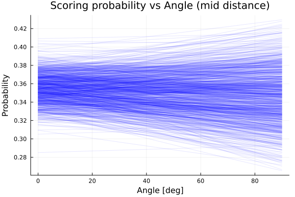
We see that the model predicts almost constant average probability as we vary the angle. This is consistent with what we already suspected, although we see there is more uncertainty about the scoring probability as we move from 0° to 90°. In conclusion, the angle doesn’t seem too important when shooting; the distance from the hoop is the relevant variable.
8.3 New model and prior predictive checks: Part II
<Why was this model chosen?>
Now we propose another model with the form:
\(p\sim logistic(a + b^{distance[i]} + c*angle[i])\)
*But for what values of b the model makes sense? Here we basically changed the dependence of the model with distance. We now have the parameter \(b\) to the power of the distance from the hoop. We should ask ourselves, like we did with the other proposed models: Would every possible value of \(b\) make sense? Let’s dig into this question.
Below we plot four function with four different possible values of \(b\), having in mind that the values of \(x\), the normalized distance, goes from 0 to 1. These functions are
f1(x) = 0.3^x
f2(x) = 1.5^x
f3(x) = -0.3^x
f4(x) = -1.5^x
and their plots are
plot(0:0.01:1, f1, label="f1: b < 1 & b > 0", xlim=(0,1), ylim=(-2,2), lw=3);
plot!(0:0.01:1, f2, label="f2: b>1", lw=3);
plot!(0:0.01:1, f3, label="f3: b<0 & b>-1", lw=3);
plot!(0:0.01:1, f4, label="f3: b<-1", lw=3);
xlabel!("Normalized distance");
title!("Prior Predictive influence of distance")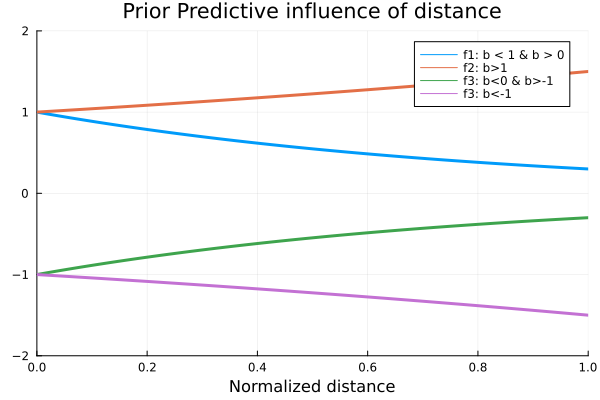
As we can see, the qualitative behavior of these functions is different for each of the chosen values for \(b\). The only one of these values that is consistent with our common sense, is the one proposed for \(f_1\), as we want it to be a decreasing function for the distance variable. In other words, we want \(b\) to be in the range from 0 to 1, and to be positive. Now that we have limited the range of values that \(b\) can take, we should propose a probability distribution that satisfies the constraints the parameter should have. For this, we propose a Beta distribution with parameters \(α=2\) and \(β=2\). We chose these distribution since it is only defined in the interval we are interesed on, and the value of the parameters so that the distribution is symmetrical, i.e., not biased towards the start or the end of the range from 0 to 1.
plot(Beta(2,2), xlim=(-0.1,1), legend=false);
title!("Prior distribution for b")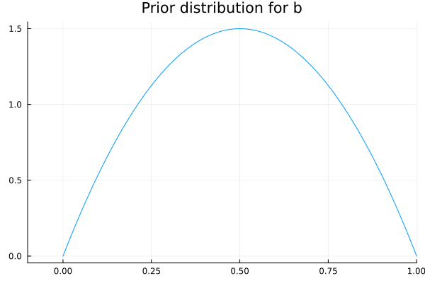
8.3.1 Defining the new model and computing posteriors
We define then our model and calculate the posterior as before.
@model logistic_regression_exp(distances, angles, result, n) = begin
  N = length(distances)
  # Set priors.
    a ~ Normal(0,1)
    b ~ Beta(2,2)
    c ~ Normal(0,1)
    for i in 1:n
        p = logistic(a +  b .^ distances[i] + c*angles[i])
        result[i] ~ Bernoulli(p)
    end
end
## logistic_regression_exp (generic function with 2 methods)# Sample using HMC.
chain_exp = mapreduce(c -> sample(logistic_regression_exp(shots.distance[1:n] ./ maximum(shots.distance[1:n] ), shots.angle[1:n], shots.result[1:n], n), HMC(0.05, 10), 1500), chainscat, 1:3)Plotting the traceplot we see again that the variable angle has little importance since the parameter \(c\), that can be related to the importance of the angle variable for the probability of scoring, is centered at 0.
plot(chain_exp, dpi=55)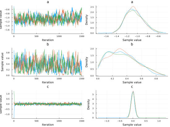
p_exp_constant_angle = []
for i in 1:length(chain_exp[:a])
    push!(p_exp_constant_angle, logistic.(chain_exp[:a][i] .+ chain_exp[:b][i].^possible_distances .+ chain_exp[:c][i].*π/4))
end
Employing the posteriors distributions computed, we plot the probability of scoring as function of the normalized distance and obtain the plot shown below.
plot(possible_distances,p_exp_constant_angle[1], legend=false, alpha=0.1, color=:blue);
for i in 2:1000
    plot!(possible_distances,p_exp_constant_angle[i], alpha=0.1, color=:blue);
end
xlabel!("Normalized distance");
ylabel!("Probability");
title!("Scoring probability vs Normalized distance (angle=45°)")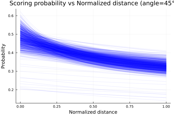
Given that we have 2 variables, we can plot the mean probability of scoring as function of the two and obtain a surface plot, too:
angle_ = collect(range(0, stop=π/2, length=100))
dist_ = collect(range(0, stop=1, length=100))
it = Iterators.product(angle_, dist_)
matrix = collect.(it)
values = reshape(matrix, (10000, 1))
angle_grid = getindex.(values,[1])
dist_grid = getindex.(values,[2])
z = logistic.(mean(chain_exp[:a]) .+ mean(chain_exp[:b]).^dist_grid .+ mean(chain_exp[:c]).*angle_grid)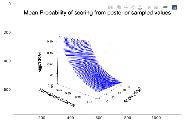
The plot shows the expected behavior, an increasing probability of scoring as we get near the hoop. We also see that there is almost no variation of the probability with the angle.
8.4 Does the Period affect the scoring probability?
We have been using the scoring data across all periods, but what about how the scoring probability changes across periods? We will propose a model and calculate the posterior for its parameters with scoring data of each of the four possible periods. The exact same model for all four periods will be used. The angle variable will be discarded from the model, as we have already saw that is of little importance.
We filter our data by period and proceed to estimate our posterior distributions.
shots_period1 = filter(x -> x.period == 1, shots)@model logistic_regression_period(distances, result,n) = begin
N = length(distances)
# Set priors.
a ~ Normal(0,1)
b ~ Beta(2,5)
for i in 1:n
p = logistic(a + b .^ distances[i])
result[i] ~ Bernoulli(p)
end
endn_ = 500 # Sample using HMC.
chain_period1 = mapreduce(c -> sample(logistic_regression_period(shots_period1.distance[1:n_] ./ maximum(shots_period1.distance[1:n_] ), shots_period1.result[1:n_], n_), HMC(0.05, 10), 1500), chainscat, 1:3)shots_period2 = filter(x -> x.period == 2, shots)# Sample using HMC.
chain_period2 = mapreduce(c -> sample(logistic_regression_period(shots_period2.distance[1:n_] ./ maximum(shots_period2.distance[1:n_] ), shots_period2.result[1:n_], n_), HMC(0.05, 10), 1500),
chainscat,
1:3
);shots_period3= filter(x->x.period==3, shots);# Sample using HMC.
chain_period3 = mapreduce(c -> sample(logistic_regression_period(shots_period3.distance[1:n_] ./ maximum(shots_period3.distance[1:n_] ), shots_period3.result[1:n_], n_), HMC(0.05, 10), 1500),
chainscat,
1:3
);shots_period4 = filter(x->x.period==4, shots);# Sample using HMC.
chain_period4 = mapreduce(c -> sample(logistic_regression_period(shots_period4.distance[1:n_] ./ maximum(shots_period4.distance[1:n_]), shots_period4.result[1:n_], n_), HMC(0.05, 10), 1500),
chainscat,
1:3
);p_period1 = logistic.(mean(chain_period1[:a]) .+ mean(chain_period1[:b]).^possible_distances )
p_period1_std = logistic.((mean(chain_period1[:a]) .+ std(chain_period1[:a])) .+ (mean(chain_period1[:b]) .+ std(chain_period1[:a])).^possible_distances)
p_period2 = logistic.(mean(chain_period2[:a]) .+ mean(chain_period2[:b]).^possible_distances )
p_period2_std = logistic.((mean(chain_period2[:a]) .+ std(chain_period2[:a])) .+ (mean(chain_period2[:b]) .+ std(chain_period2[:a])).^possible_distances)
p_period3 = logistic.(mean(chain_period3[:a]) .+ mean(chain_period3[:b]).^possible_distances)
p_period3_std = logistic.((mean(chain_period3[:a]) .+ std(chain_period3[:a])) .+ (mean(chain_period3[:b]) .+ std(chain_period3[:a])).^possible_distances)
p_period4 = logistic.(mean(chain_period4[:a]) .+ mean(chain_period4[:b]).^possible_distances )
p_period4_std = logistic.((mean(chain_period4[:a]) .+ std(chain_period4[:a])) .+ (mean(chain_period4[:b]) .+ std(chain_period4[:a])).^possible_distances)We plot now for each period the probability of scoring for each period, each mean and one standard deviation from it.
plot(possible_distances, p_period4,ribbon=p_period4_std.-p_period4,  color=:magenta, label="period4", fillalpha=.3, ylim=(0,0.6));
plot!(possible_distances, p_period2, color=:green, ribbon=p_period2_std.-p_period2, label="period2", fillalpha=.3);
plot!(possible_distances, p_period3, color=:orange, ribbon=p_period3_std.-p_period3, label="period3",fillalpha=.3);
plot!(possible_distances, p_period1,ribbon=p_period1_std.-p_period1, color=:blue, label="period1", fillalpha=.3);
xlabel!("Normalized distance");
ylabel!("Scoring probability")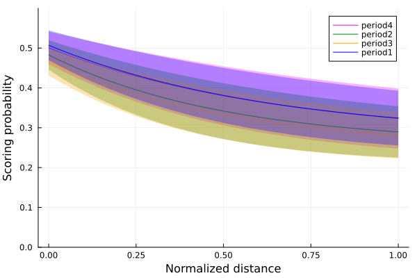
Comparing the means of each period, we see that for the periods 1 and 4, the first and the last periods, the scoring probability is slightly higher than the other two periods. There are a bunch of possible explanations for these results. Clearly in the first period, players are most effective due to being with the most energy. In period 4, new players have substituted the old ones, and also have a lot of energy, while in periods 2 and 3, there is a tendency for more tired players that have not been substituted. These hypothesis should be tested to know if they are correct, but it is a starting point for more data analysis.
8.5 Summary
In this chapter, we used the NBA shooting data of the season 2006-2007 to analyze how the scoring probability is affected by some variables, such as the distance from the hoop and the shooting angle.
First, we inspected the data by plotting a heatplot of all the shots made and making histograms of the ones that scored. As our goal was to study the scoring probability, which is a Bernoulli trial situation, we decided to use a Bernoulli model. Since the only parameter needed in a Bernoulli distribution is the probability \(p\) of having a success, we modeled \(p\) as a logistic function: \(p\sim logistic(a+ b*distance[i] + c*angle[i])\)
We set the prior probability of the parameters \(a\) and \(c\) to a Normal distribution and \(b\) to a LogNormal one. Thus, we constructed our logistic regression model and sampled it using the Markov Monte Carlo algorithm (MCMC). To gain a better understanding of the sampling process, we made a traceplot that shows the sampled values in a sequential order.
Later, we decided to try with a more complex logistic regression model, similar to the first one but this time modifying the distance dependency: \(p\sim logistic(a+ b^{distance[i]} + c*angle[i])\)
We set the prior distribution of \(b\) to a beta distribution and constructed the second logistic regression model, sampled it and plotted the results.
Finally, we analyzed the results to see if the period of the game affects the scoring probability.